Unique Coco
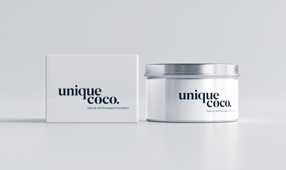
Brand image and packaging for a natural cosmetics line.
Client
Unique CocoDisciplines
Sector

Project concept
This brand stands for nature and environmental protection and focuses on simplicity and minimalism. The stylish logo has a refined look with clean lines and spacing that symbolises the brand’s emphasis on purity and essentials, while a touch of dark brown pays tribute to the natural origin of the ingredients.
The brand’s packaging design reflects its core principles. Without excessive embellishment, the clean surface serves as a canvas for the product itself to shine without distraction. The primary palette of white and black highlights the minimalist approach that appeals to its audience, inviting them to embrace a less-is-more lifestyle. The packaging goes beyond its functional purpose and becomes a symbol of a philosophy that appreciates the elegance of simplicity.


Makeup bag
Seeking packaging design
that reflects your unique identity?
Every package has a unique story to tell. It is an opportunity to communicate emotions and narratives through design. We can certainly help you.
Simply click below for a custom design plan based on your goals, timeline and budget – at no cost and without obligation.


