Meirovich Consulting
Brand design for a
healthcare consulting company.
Client
Meirovich ConsultingDiscipline
Sectors
Project concept
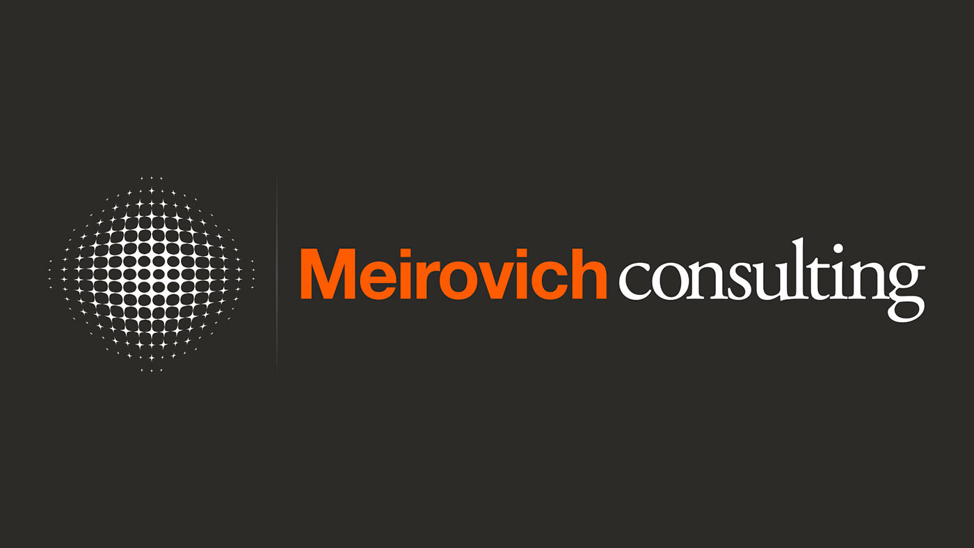
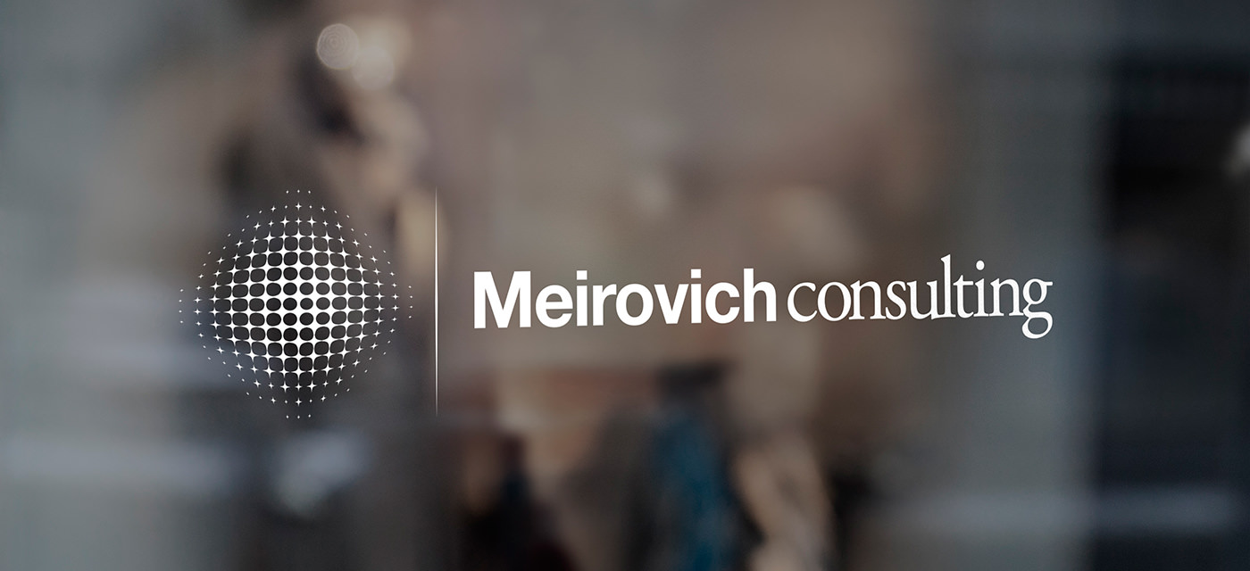
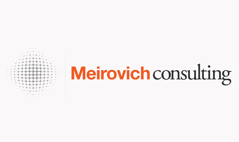
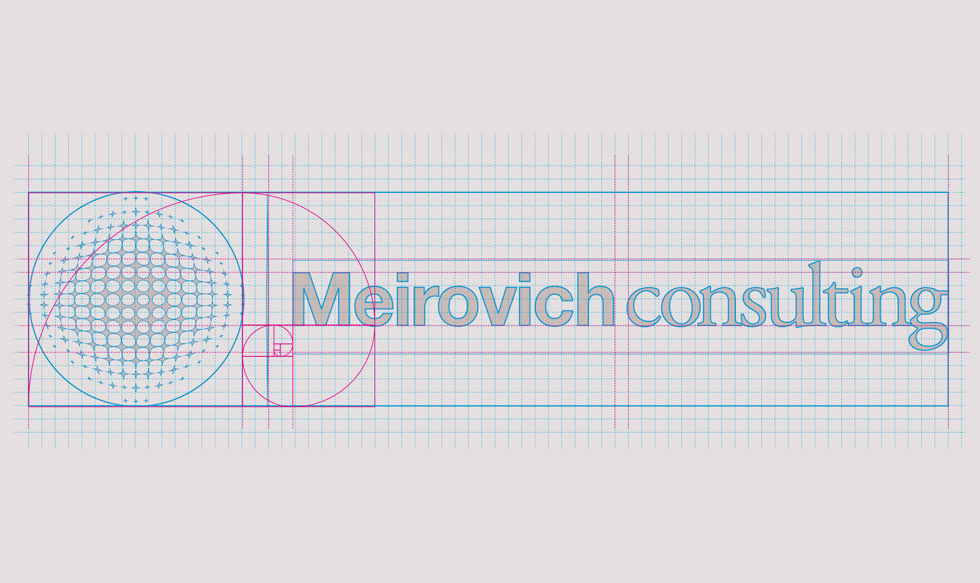
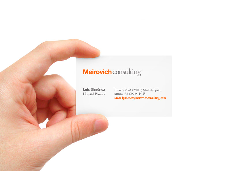
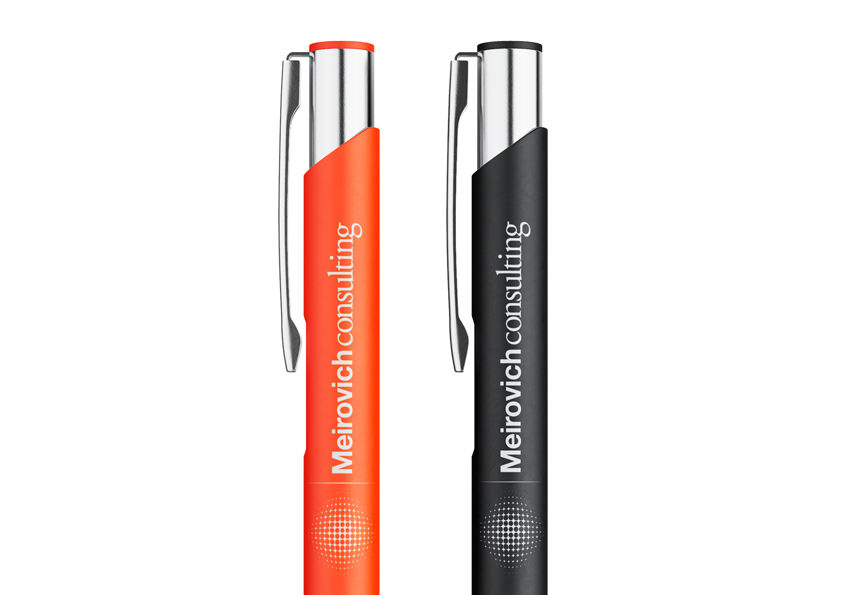
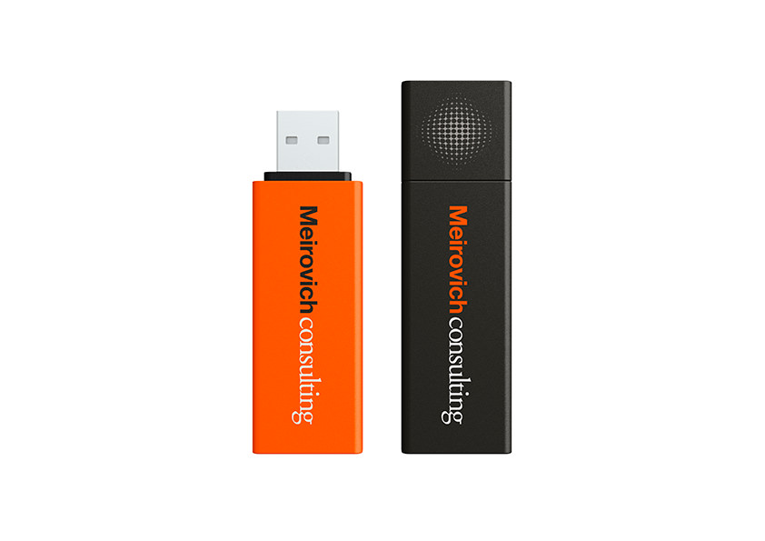
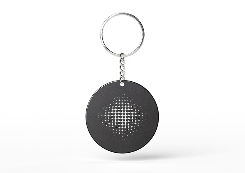
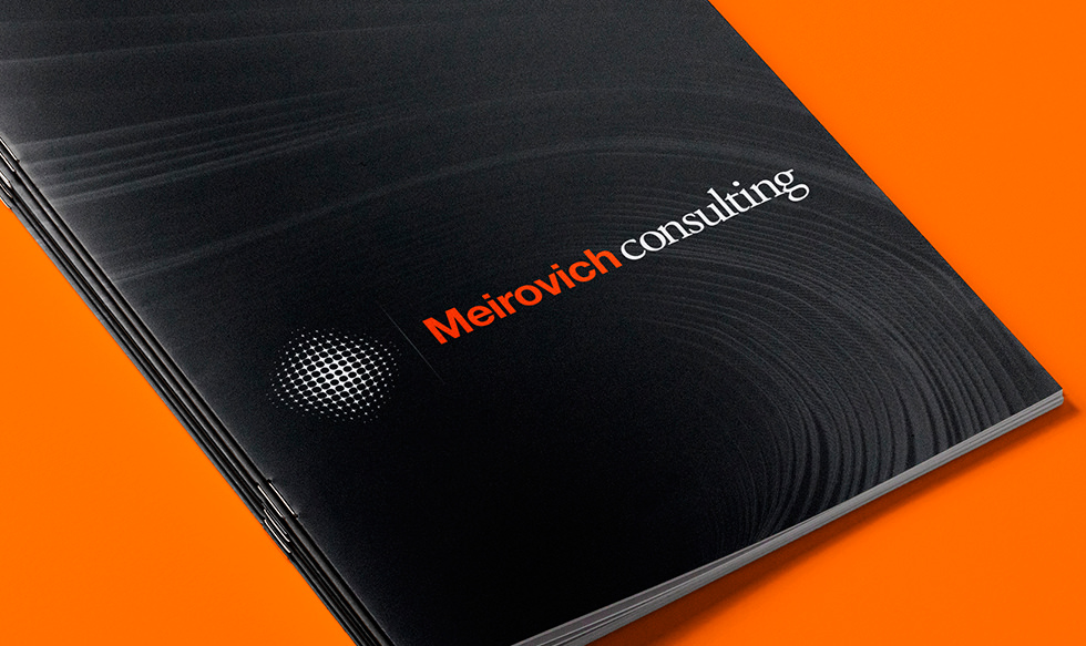
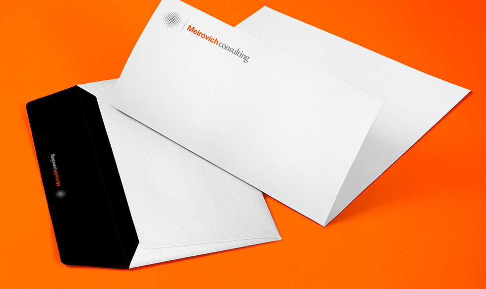
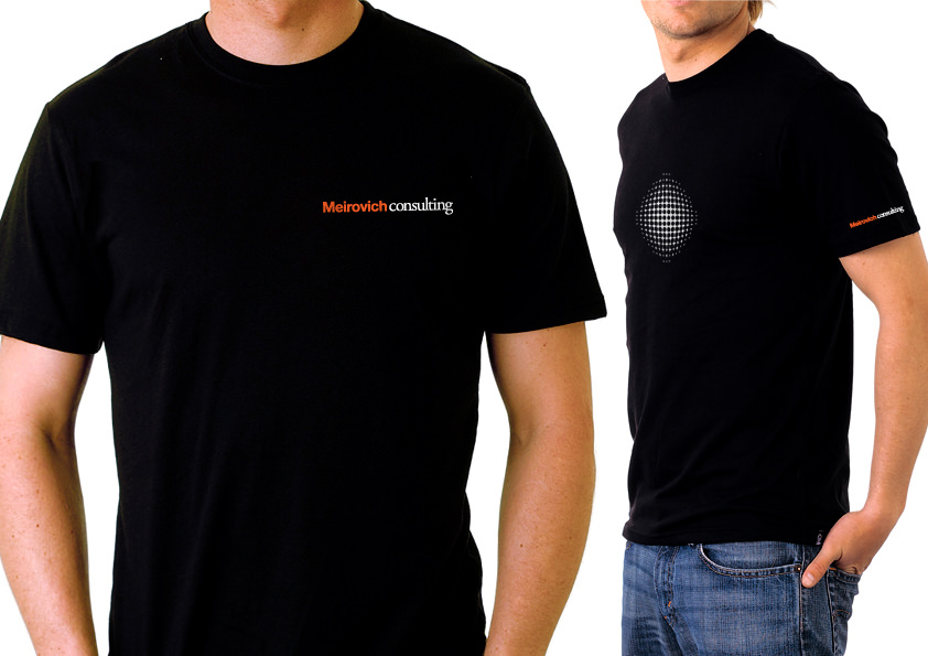
Meirovich Consulting, a company specialising in engineering, architecture and medical planning solutions, was looking for a logo that would reflect its professionalism. The resulting design features clean lines and bold typography, conveying precision, attention to detail and confidence in their services.
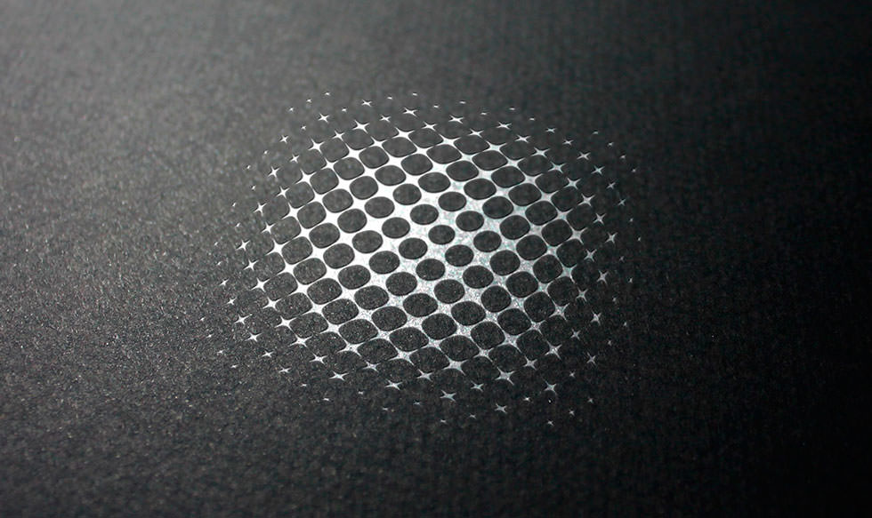
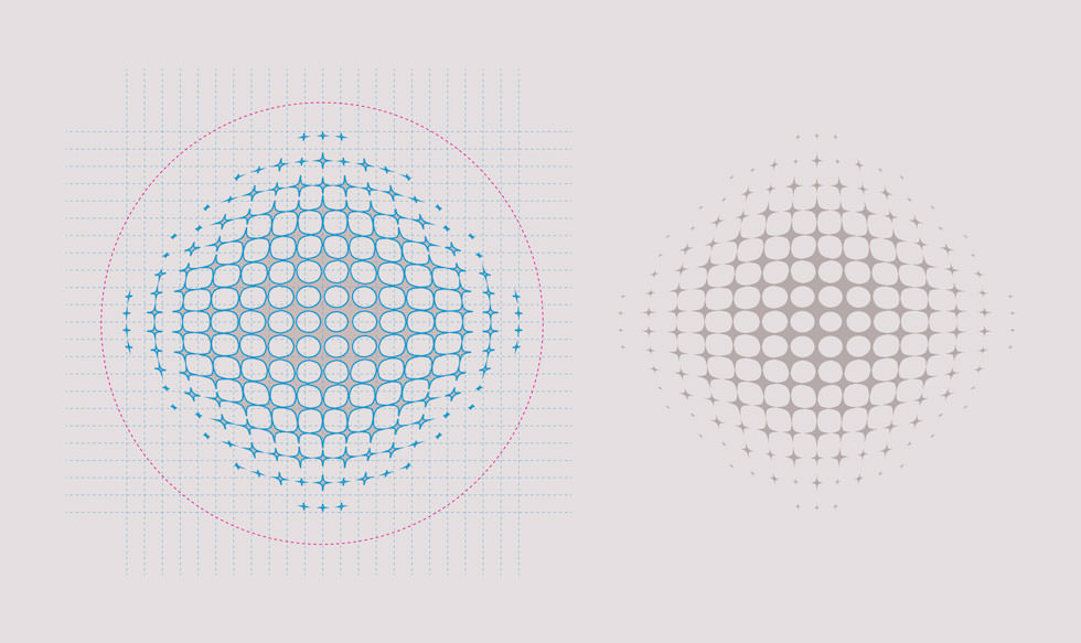
Inspired by the illuminating power of light, derived from the Hebrew word “Meir” meaning “light”, the logo reflects the profound knowledge and expertise of Meirovich Consulting. A carefully integrated grid structure enhances the design, which is tailored to the specific needs of the company and underlines its commitment to excellence.

The concept of “light” for the logo

Want to improve the impact of
your brand and website?
Our award-winning design team can help you do just that. With our experience in developing a cohesive and recognisable brand identity and creating user-friendly and visually stunning websites, we’ll work with you to create a seamless brand and web experience that truly represents your business.
Simply click below for a custom design plan based on your goals, timeline and budget.