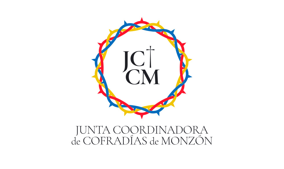
Junta Coordinadora de Cofradías de Monzón
Logo design for a brotherhood organisation.
Client
Junta Coordinadora de Cofradías de MonzónDiscipline

Project concept
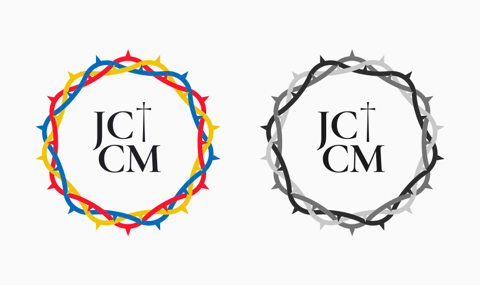
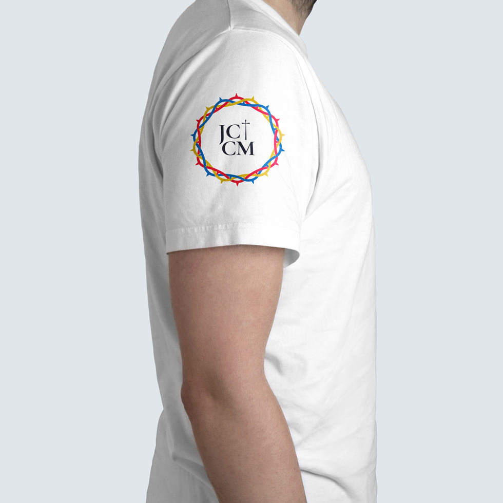
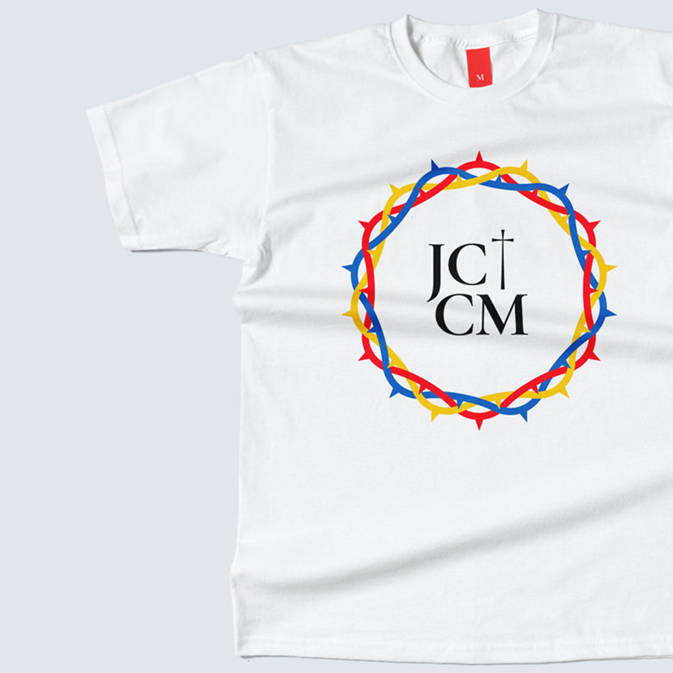
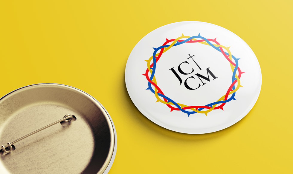
The Brotherhood Board of Monzón sought a logo that reflected its identity and the city of Monzón, Spain. The design includes a crown of thorns, the letters J, JC and M and a cross. The crown of thorns symbolises the unity, strength and coordination of the brotherhoods with the colours of the city of Monzón. The typography chosen evokes the nails of the Passion, the name of Jesus Christ and the letter M represents the presence of the Virgin Mary at the foot of her crucified Son.
By using elements such as the crown of thorns, the cross, and the letters J, JC, and M, the aim is to evoke the biblical and spiritual aspect of the Passion, suffering and sacrifice of Jesus, generating an emotional resonance in those connected to the organisation of brotherhoods.
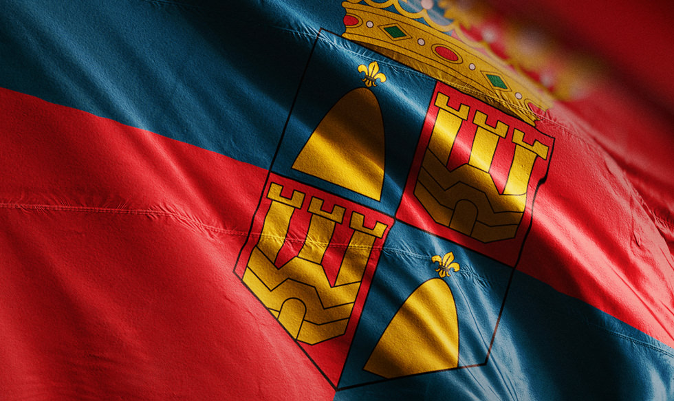
The flag of the city of Monzón

The cross

The crown of thorns

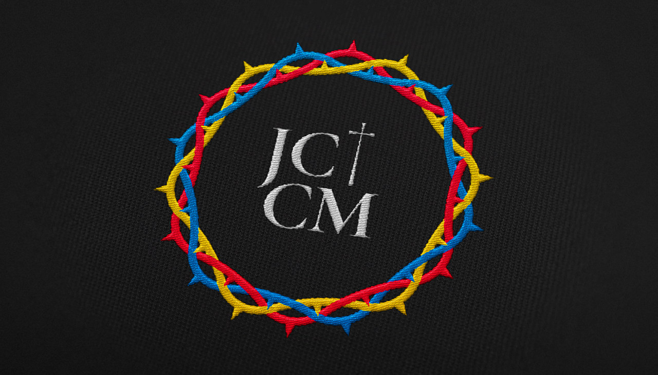
The logo embroidered on fabric


The typographic logo
Need logo design
for your organisation?
Let us help you convey your values in a memorable way through a flexible logo to use everywhere.
Simply click below to let us know your needs and receive a plan based on your goals, timeline and budget.